Orange is one of the most dynamic and versatile colors in the spectrum. It exudes energy, warmth, and creativity, making it a popular choice in art, design, fashion, and interior decor. Whether you prefer bold, fiery shades or muted, earthy tones, the orange color palette offers endless possibilities for creating impactful and harmonious designs. In this article, we’ll explore the psychology of orange, its various shades, and how to incorporate it effectively in different contexts.
1. Understanding the Psychology of Orange
Orange is considered a warm color, sitting between red and yellow on the color wheel. It combines the passion and energy of red with the happiness and optimism of yellow, creating a hue that feels vibrant and welcoming.
Symbolism and Emotions Associated with Orange:
- Energy and Enthusiasm: Orange is often associated with excitement, creativity, and motivation.
- Warmth and Comfort: Softer tones of orange evoke feelings of coziness and warmth, making them perfect for home decor.
- Playfulness: Bright oranges convey a sense of fun and spontaneity, ideal for youthful and dynamic designs.
- Vitality and Health: Orange is commonly used to represent vitality, health, and wellness due to its connection with fruits like oranges, mangoes, and apricots.
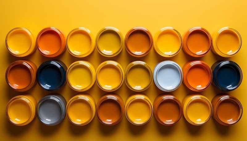
2. Exploring Shades of Orange
The orange color palette encompasses a wide range of shades, each with its unique character and appeal. Below are some popular shades of orange and their uses:
- Bright Orange: A bold, vibrant hue that grabs attention. Great for creating energetic designs or statement pieces in fashion and decor.
- Burnt Orange: A rich, earthy shade with brown undertones. This timeless color works well in rustic or autumn-inspired aesthetics.
- Peach: A soft, pastel orange with hints of pink. Perfect for creating a romantic and calming ambiance.
- Coral: A blend of orange and pink, coral is lively yet sophisticated, making it ideal for modern and tropical designs.
- Terracotta: A muted, earthy orange with red-brown undertones. Often used in traditional or Mediterranean-inspired interiors.
- Amber: A golden-orange tone with a warm, radiant quality. It brings elegance and sophistication to any design.
3. Using an Orange Color Palette in Design
Orange is a versatile color that can be paired with a variety of hues to create stunning combinations. Here are some tips for using orange in design:
1. Pairing Orange with Neutrals
- Pairing orange with neutral tones like white, beige, or gray allows the color to stand out without overwhelming the design.
- Example: A burnt orange accent chair against a neutral gray wall creates a bold yet balanced look.
2. Complementary Color Combinations
- Orange’s complementary color is blue, as they sit opposite each other on the color wheel.
- Example: A navy and bright orange combination creates a striking contrast, perfect for bold and modern designs.
3. Monochromatic Orange Palettes
- Use varying shades of orange to create depth and harmony in a monochromatic design.
- Example: Combine peach, coral, and terracotta tones for a cohesive yet dynamic color scheme.
4. Analogous Color Schemes
- Pair orange with neighboring colors on the color wheel, such as red and yellow, for a warm and harmonious palette.
- Example: A coral and golden yellow palette evokes a cheerful and sunny vibe.
4. Incorporating Orange into Interior Design
Orange can transform a space, whether as a bold statement color or a subtle accent. Here’s how you can incorporate orange into your interiors:
- Accent Walls: A burnt orange or terracotta accent wall can add depth and warmth to a living room or bedroom.
- Furniture: Opt for orange sofas, chairs, or ottomans to create a focal point in your space.
- Accessories: Introduce orange through throw pillows, rugs, curtains, or artwork for a subtle yet impactful touch.
- Kitchens and Dining Areas: Use orange in kitchens for a lively and appetizing atmosphere. Consider orange bar stools, dishes, or even a backsplash.
5. Orange in Fashion and Personal Style
Orange is a bold choice in fashion, but when styled correctly, it can make a powerful statement. Here’s how to incorporate orange into your wardrobe:
- Statement Pieces: Wear a bright orange dress, blazer, or top for a head-turning look.
- Accessories: Add orange through scarves, handbags, or shoes to inject a pop of color into your outfit.
- Seasonal Styles: Burnt orange and terracotta tones are perfect for fall, while coral and peach are ideal for spring and summer.
- Color Pairings: Pair orange with navy, olive green, or cream for a sophisticated look, or combine it with other bright colors for a playful, eclectic style.
6. Orange in Branding and Marketing
Orange is a popular choice for branding because it conveys energy, creativity, and friendliness. Many companies use orange to stand out and create a memorable identity. For example:
- Food and Beverage Brands: Orange is often used to stimulate appetite and evoke freshness.
- Tech and Innovation Companies: Bright orange is associated with creativity and forward-thinking.
- Fitness and Wellness Brands: Orange conveys vitality and energy, making it a great fit for health-focused businesses.
7. Tips for Balancing Orange
While orange is a versatile and captivating color, it’s important to use it thoughtfully to avoid overwhelming a design. Here are some tips for achieving balance:
- Use orange as an accent color rather than the dominant hue in a design.
- Pair bright oranges with cool or neutral tones for contrast and harmony.
- Opt for muted or pastel oranges if you want a more subdued and calming effect.
Conclusion
The orange color palette is a rich and diverse spectrum that offers endless opportunities for creativity and expression. Whether you’re designing a room, curating a wardrobe, or creating a brand, orange can bring energy, warmth, and personality to your vision. From bold and vibrant shades to soft and earthy tones, orange is a color that never fails to make an impact.
By understanding the psychology of orange and exploring its various shades, you can confidently incorporate this dynamic hue into your designs, decor, and style. Let the orange color palette inspire you to create spaces and styles that are as vibrant and unique as the color itself.
For more visit, our website, Homethreads